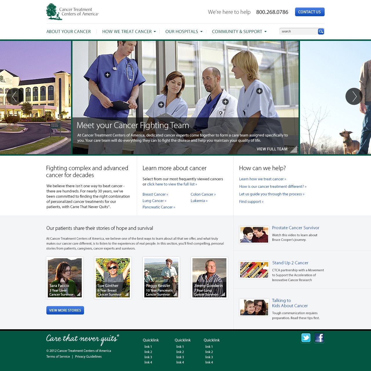
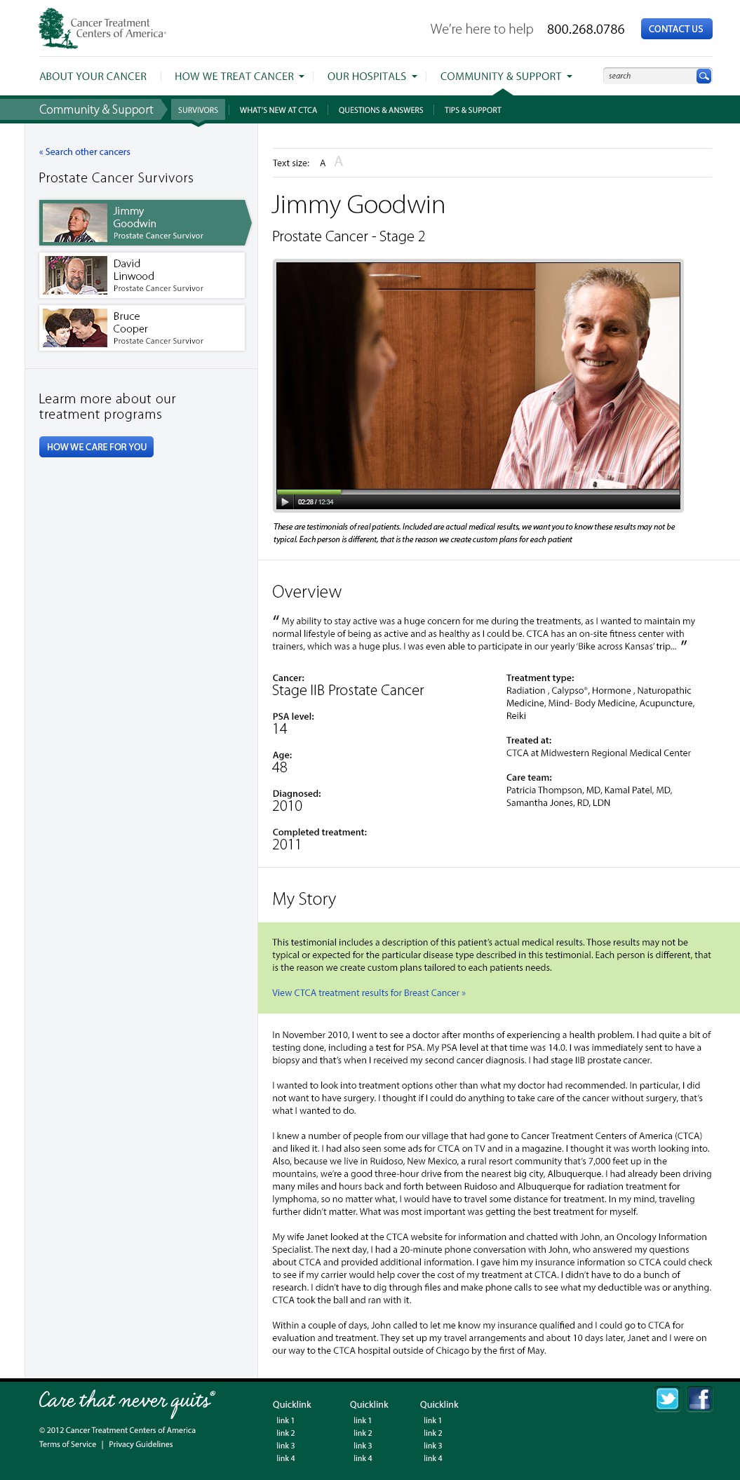
In 2012 I led a comprehensive redesign of Cancer Treatment Centers of America’s website, transforming a sprawling, content heavy portal into a more approachable, patient-focused resource. The work spanned the homepage, disease-specific hubs, community & support sections, survivor stories and the news/blog area. Each of these sections required a clearer information hierarchy, stronger visual cues and more inviting calls to action for patients and caregivers seeking support or treatment. A glance at the archived site on the Wayback Machine shows the original layout: static pages with tightly packed links, muted typography and few visual signposts to guide users. The new homepage (above) embraces generous white space, a modular card layout for “Meet Your Cancer-Fighting Team” and “Patient Stories,” and calls to action such as “Contact Us,” “Learn More” and “Talk to Us” that lead visitors through diagnosis information, treatment options and community resources. We simplified the primary navigation by replacing deep dropdown menus with three clear hubs: About Your Cancer, How We Treat Cancer and Community & Suppor†, and elevated the sitewide phone number and “We’re here to help” banner to reinforce CTCA’s 24/7 care promise. Inner pages received the same patient-first treatment. Survivor profiles now open in a responsive, video template with key statistics front and center. Blog and news feeds were rebuilt as clear, filterable lists. And “Become a Patient” pathways are woven throughout every page. The result is a more human, story driven experience that puts critical information at users’ fingertips and positions CTCA not just as a treatment center but as a trusted partner in each patient’s journey.